

This is Part 3 of our SAP Analytics Cloud Terminology Series for data engineers. We follow Marie — a data engineer from Azure and Databricks — through her first SAC project at RetailCo France. In Part 1 we covered platform basics. In Part 2 we survived the data modelling workshop. Now the build starts — and Marie builds her first Story.
The moment Marie stopped being the data person and became the dashboard person
Week three. The data modelling workshop was done. The SAC Models were designed — one Analytical Model for operational reporting, one Planning Model for the finance team’s budget cycle. The connections between RetailCo’s Azure Data Lake and SAC were being configured in parallel by Thomas on the technical side.
Laurent called Marie over to his laptop on Monday morning.
“The models are ready enough to start building. I want you to build the first Story — the store performance dashboard the regional directors asked for.”
Marie looked at him. “Me? I am the data engineer. I build pipelines. Thomas builds dashboards.”
Laurent shook his head. “Thomas is busy with the BTP configuration. And honestly — you understand the data better than anyone on this project. You know what is in the model. You know what the numbers mean. Building the Story is not as technical as you think.”
Marie sat down at Laurent’s laptop, opened the SAC development tenant, navigated to Stories, and clicked New Story.
A blank canvas appeared.
She stared at it for approximately forty-five seconds. Then she opened Teams and sent Thomas a message. “Where do I start.” It was not a question. It was a cry for help disguised as a statement. Thomas replied immediately. “I will walk you through it. Give me ten minutes.”
What Thomas explained to Marie over the next two hours is what this part covers. Six terms. Six concepts. And by the end of week three Marie had built a dashboard that made the regional directors genuinely excited in the review meeting — which is the best possible outcome on any SAP project.
Term 1 — Page: Like a notebook in a Databricks workspace, but for dashboards
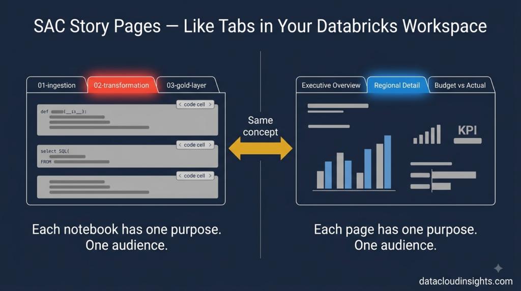
Marie knew Databricks notebooks. A notebook is a container — a collection of cells, each doing something specific, organised in a logical sequence. You might have a notebook for ingestion, a notebook for transformation, a notebook for validation. Each notebook has a clear purpose and a clear audience.
Thomas explained Pages using exactly that reference.
“A Page in SAC is like a notebook in your Databricks workspace — but for dashboards instead of code. Each Page in a Story is a separate canvas with its own charts, tables, and filters. Each Page has a clear purpose and a clear audience.”
The RetailCo store performance Story that Marie was building had four Pages planned:
Page 1 — Executive Overview. For the CFO and the board. Three big numbers at the top — total revenue across all 80 stores, total costs, gross margin. Clean. Minimal. Answers the question the CFO asks every Monday morning: how are we doing overall?
Page 2 — Regional Breakdown. For the four regional directors. Revenue, costs, and margin broken down by region and by store within each region. More detail than the CFO needs but exactly what regional directors need to manage their teams.
Page 3 — Product Performance. For the merchandising team. Which product categories are driving revenue. Which are underperforming against plan. Trend lines showing whether the trajectory is improving or worsening.
Page 4 — Budget vs Actual. For the finance team. Every cost centre, their approved budget, their actual spending, the variance, the variance percentage. The numbers the finance team live and die by every month end.
Same Story. Four Pages. Four audiences. Each Page focused on one specific business question.
Marie liked this immediately. It mapped to how she thought about data products — one pipeline, multiple outputs, each serving a different consumer.
“So the Story is the pipeline and the Pages are the output tables?” she offered.
Thomas laughed. “That is the most data engineer way anyone has ever described a dashboard. But yes — roughly.”
One practical thing Marie learned on day two of building: Pages in SAC can be linked. You can add navigation buttons that take users from Page 1 to Page 2, or configure automatic navigation that jumps to a detail Page when a user clicks on a specific chart element. Like hyperlinks between notebooks — except the navigation is driven by user interaction with the data, not by code.
Term 2 — Widget: Every element on a Page is a Widget
In Databricks a notebook cell is the atomic unit — the smallest thing you work with. A cell contains either code or markdown. Everything in a notebook is made of cells.
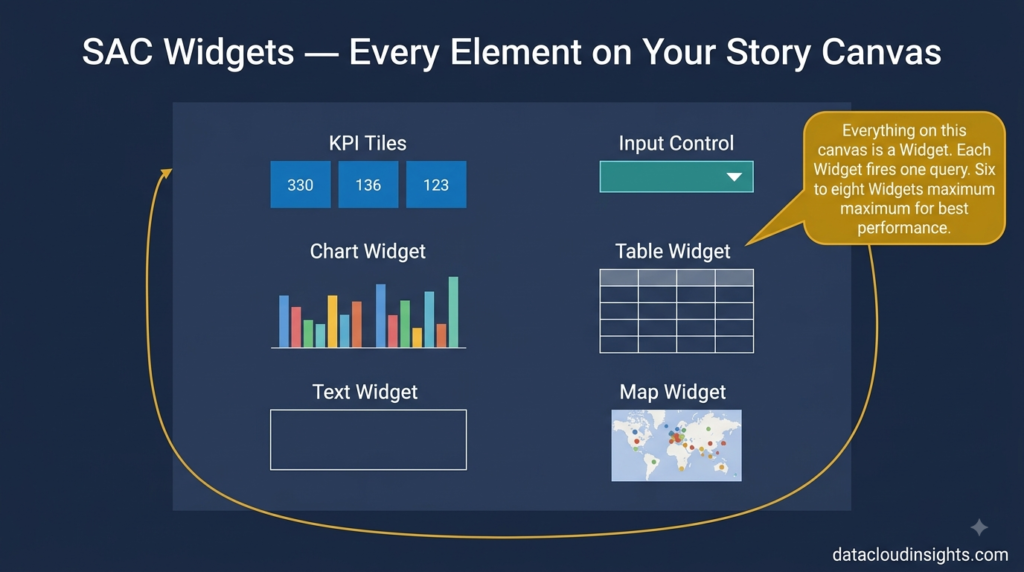
In SAC a Widget is the atomic unit of a Story Page. Everything you add to a Page canvas is a Widget — charts, tables, KPI tiles, text boxes, images, filter dropdowns, shapes, buttons. Every single element is a Widget.
When Thomas first said “add a Widget to the Page” Marie asked the obvious question.
“How?”
“Click Insert in the top menu. Everything in that menu is a Widget.”
Marie clicked Insert. The dropdown showed Chart, Table, KPI Tile, Text, Image, Input Control, Shape, Button, and several more options. She selected Chart. A placeholder appeared on the canvas — an empty rectangular Widget waiting to be configured.
“Now connect it to the Model,” Thomas said.
Marie selected the Model in the right panel. Then she dragged Revenue onto the Values field. Dragged Region onto the Dimension field. SAC immediately rendered a bar chart showing revenue by region.
She stared at it.”That was ten seconds,” she said.
“Yes,” said Thomas.
In her Azure world getting to this point would have involved checking the Delta Lake table, opening Power BI Desktop, connecting to the dataset, creating a measure, building the visualisation, publishing to the Power BI service. Fifteen minutes minimum. Often longer.Ten seconds in SAC felt almost suspicious.
The important practical thing about Widgets — each one on a Page fires its own independent query to the Model every time the Page loads or a filter changes. This has performance implications. A Page with fifteen Widgets fires fifteen queries simultaneously. A Page with five Widgets fires five queries.
Marie’s data engineering instinct kicked in immediately.
“So the number of Widgets per Page is a performance consideration.”
“Exactly,” said Laurent who had been listening from across the room. “We recommend maximum six to eight Widgets per Page. More than that and load times suffer. If you need more visualisations — add a Page.”
This is one of those SAC performance rules that data engineers understand intuitively once it is explained in query terms. Each Widget is a query. Fewer queries per page load means faster page load. Simple.
Term 3 — KPI Tile: The metric card that every executive dashboard needs
Marie had seen KPI cards in Power BI. A small visual element showing one number — total revenue, total cost, gross margin percentage — with a comparison value and a colour indicator showing whether the number is good or bad.
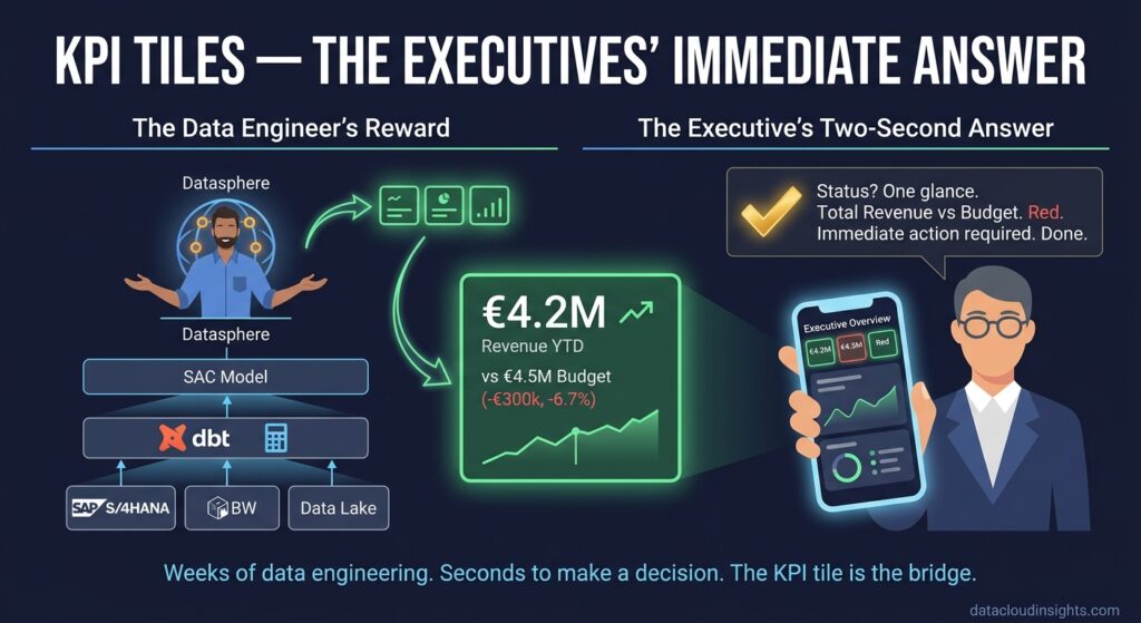
SAC’s KPI Tile is the same concept. A compact Widget that displays a single key performance indicator — the primary value, a comparison value, the variance between them, and a colour signal. Green for positive. Red for negative.
Thomas configured the first KPI Tile with Marie watching.
Primary Value — Revenue. Set to Current Year to Date sum.
Comparison Value — Budget. Set to Budget Year to Date sum.
SAC automatically calculated the variance — actual revenue minus budget revenue — and displayed it as both an absolute number (minus €300,000) and a percentage (minus 6.7 percent). The tile turned red because revenue was below budget.
“That is it?” Marie asked.
“That is it.”
Three clicks. One KPI Tile. The CFO’s most important number — are we above or below budget — visible in three seconds.
Marie built the three KPI Tiles for the Executive Overview Page in under five minutes. Revenue vs Budget. Cost vs Budget. Gross Margin vs Prior Year. She arranged them across the top of the Page in a row — the standard layout for executive dashboards.
She leaned back and looked at the Page. Three KPI Tiles at the top showing the headline numbers. Clean. Immediately readable.
“Laurent is going to love this,” Thomas said.
“It took me five minutes,” Marie said, still slightly suspicious that it had been that easy.
“The data preparation took weeks,” Thomas reminded her. “The modelling took days. The visualisation takes minutes — if the foundation is right. That is how SAC is supposed to work.”
Marie thought about that. In her Azure world she had always thought of the visualisation layer as the easy part — Power BI on top of a solid Databricks gold layer. SAC worked the same way. The hard work was in the pipeline and the model. The Stories were the reward for doing that work correctly.
One thing Marie noticed about KPI Tiles that Thomas confirmed — they are the single most-looked-at element on any executive dashboard. The CFO spends two seconds on a KPI Tile and moves on. The charts are for when the KPI Tile shows something unexpected and the CFO needs to understand why.
Design your KPI Tiles first. They define what the dashboard is about. Everything else supports them.
Term 4 — Input Control: The parameter widget that replaces hardcoded filters
Marie knew parameters. In Databricks notebooks she used widgets — dbutils.widgets.dropdown — to create interactive parameters that let users select values and run the notebook with different inputs without changing any code. A date range parameter. A region parameter. A product category parameter.
SAC Input Controls are the dashboard equivalent. A Widget that lets Story users interactively filter the data displayed — without editing the Story or touching the underlying Model.
Thomas built a Region Input Control on the Regional Breakdown Page while Marie watched.
Click Insert → Input Control → Select Dimension → Region.
A dropdown appeared on the canvas showing all four RetailCo regions — North, South, East, West — plus an All option at the top.
“Now watch,” Thomas said. He selected North from the dropdown.
Every chart and table on the Page instantly updated to show only North region data. Revenue by store — only North stores. Product breakdown — only North region products. Budget vs Actual table — only North region cost centres.
One selection. Everything updated. Instantly.
“That is linked to everything on the Page?” Marie asked.
“By default yes — an Input Control affects all Widgets on the same Page that use the same Model. You can configure exceptions if needed — a specific Widget that should not respond to a particular filter — but the default is everything updates together.”
Marie thought about this from a data engineering perspective. In her Databricks world, filtering was a code concern — WHERE clauses in SQL, filter conditions in PySpark, DAX filter context in Power BI. The filter logic lived in the code or the model.
In SAC the Input Control is a no-code filter mechanism that any business user can interact with. The regional director selects their region. The logistics manager selects their warehouse. The finance controller selects their cost centre. No SQL. No DAX. No Python. Just a dropdown.
Marie built four Input Controls for the store performance Story — Region, Product Category, Time Period, and Store. She arranged them in a row across the top of each Page where they needed them.
Then she discovered something that delighted her inner data engineer.
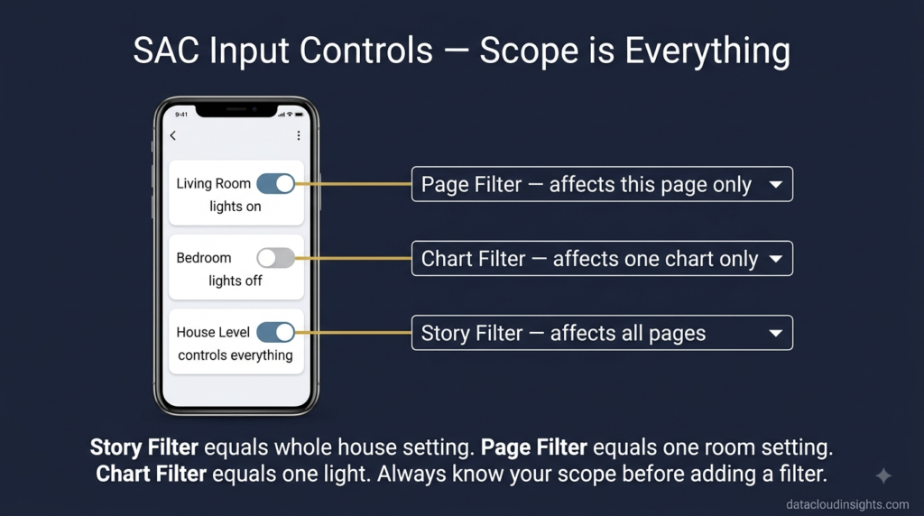
Input Controls can be scoped at different levels.
A Story-level Input Control filters every Page in the entire Story. Select Current Year in the Time Period control on Page 1 — and Page 2, Page 3, and Page 4 all filter to Current Year automatically. One filter, everything updates, everywhere.
A Page-level Input Control filters only the Page it lives on. The Region filter on the Regional Breakdown Page affects only that Page. The Executive Overview Page is unaffected.
A Widget-level filter — not a visible Input Control but a permanent filter applied to one specific Widget — restricts one chart without affecting anything else on the Page.
“It is like filter scope in dbt,” Marie said. “Model level, node level, column level.”
Thomas had never used dbt. But he understood the concept.
“Exactly that,” he said. “Always think about scope before you add a filter. The wrong scope causes either too much filtering or not enough.”
Term 5 — Drill Down: Hierarchy navigation that users control themselves
Marie had configured drill-down in Power BI before. Define a hierarchy in the Power BI data model — Product Category above Product Line above SKU — and Power BI enables drill-down buttons on charts. Users click the drill-down arrow, the chart goes one level deeper, click again and it goes deeper still.
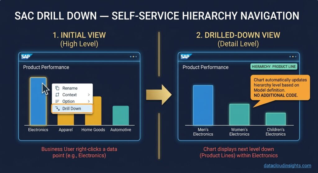
SAC Drill Down works on the same principle. The hierarchy is defined in the SAC Model (as covered in Part 2). In a Story, charts that use a dimension with a hierarchy automatically support drill-down navigation.
The difference Marie noticed was how natural the interaction felt in SAC compared to Power BI.
In Power BI, drill-down requires clicking small arrows in the corner of the visual — a slightly hidden interaction that many business users discover only after being shown it. In SAC, right-clicking any data point on a chart presents a context menu with Drill Down as a prominent option. More discoverable. More natural.
Thomas showed Marie by right-clicking on the Electronics bar in the Product Performance chart.
A context menu appeared. He clicked Drill Down. The chart immediately zoomed into Electronics — showing revenue by Product Line within Electronics. Men’s Electronics, Women’s Electronics, Children’s Electronics broken out as separate bars.
He right-clicked on Men’s Electronics and drilled again. Now individual SKUs within Men’s Electronics appeared.
“And to go back up?” Marie asked.
Right-click → Drill Up. The chart returned to Product Category level.
“What if I want to see Category and Line at the same time — not either-or?”
“That is Drill Through rather than Drill Down — you configure a separate Page that opens when users click a data point, showing the detail level. We will set that up for the Regional Directors Page so clicking on a region navigates to a store-level detail Page automatically.”
Marie made a note. Drill Down navigates within a chart by changing the hierarchy level displayed. Drill Through navigates to a different Page with more detail. Different interaction, different use case, both important.
From a data engineering perspective — Drill Down requires nothing from Marie. The hierarchy is defined in the Model. SAC handles the rest. No code, no additional queries to write, no parameters to pass. The hierarchy definition she created in Part 2 is doing all the work here automatically.
This is a recurring theme in SAC that Marie was starting to appreciate. The investment in good Model design pays dividends everywhere in the Story layer. Every hierarchy, every calculated measure, every restricted measure defined carefully in the Model makes the Story building faster and more consistent.
Term 6 — Linked Analysis: The feature that made the regional directors’ eyes light up
This was the one that impressed the business stakeholders most in the review meeting. And it is the one Marie almost did not include because she thought it was too complex.
Thomas convinced her to add it on Thursday afternoon, two hours before the review meeting.
“Add Linked Analysis between the map and the store performance table,” he said.
“How long will it take?”
“Three minutes.”
Marie was sceptical. She added it anyway.
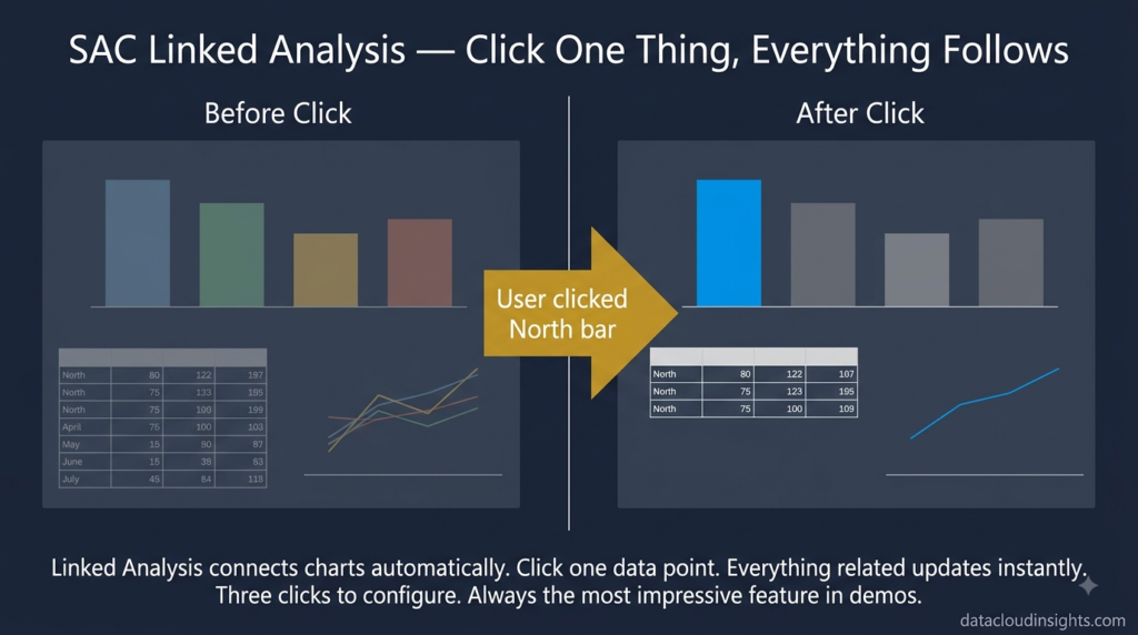
Linked Analysis connects two or more Widgets on a Page so that clicking a data point in one Widget automatically filters all linked Widgets to show only related data.
It is different from an Input Control. An Input Control is a manual filter the user explicitly sets. Linked Analysis is an automatic filter triggered by clicking on a visualisation element.
Thomas right-clicked on the revenue chart on the Regional Breakdown Page, selected Linked Analysis, and linked it to the store performance table below it.
Three clicks. Thirty seconds.
“Now click on the North bar in the chart,” he said.
Marie clicked North.
The store performance table immediately filtered to show only the twelve North region stores. Revenue, costs, margin, and budget variance for each North store only. Everything else disappeared.
She clicked on South. The table updated instantly to show only South stores.
She clicked on North again. Back to North stores.
“And if I click somewhere that is not a bar?” she asked.
“Click on the white space in the chart background.”
She clicked. The table returned to showing all stores across all regions.
Marie sat back.
“That is going to look very impressive in the review meeting.”
It did. The regional director for the North clicked on the North bar in the chart, watched the table filter to his stores instantly, and then turned to Laurent and said “can we have this for every report?”
Laurent smiled. “That is the plan.”
From a data engineering perspective Linked Analysis is essentially a cross-filter — clicking on a dimension member in one visual passes that member as a filter context to all linked visuals. In Power BI this is called cross-filtering and is configured in the data model relationships. In SAC it is configured at the Story level, between specific Widgets, without needing to touch the Model.
The flexibility to configure it at Story level rather than Model level means different Stories can have different Linked Analysis configurations on the same Model. The marketing Story might link the product chart to the regional map. The finance Story might link the cost centre table to the time trend chart. Same Model underneath. Different interaction patterns on top.
The review meeting — end of week three
Thursday afternoon. The four regional directors, the CFO, and the finance controller sat around the conference room screen. Laurent presented. Marie sat at the back of the room.
Laurent clicked through the four Pages. KPI Tiles at the top of Page 1 showing revenue, cost, and margin against budget. The regional map on Page 2. The product breakdown on Page 3. The budget versus actual table on Page 4.
Then he demonstrated the Input Controls — selecting regions, time periods, product categories, watching everything update.
Then Linked Analysis — clicking on regions in the chart and watching the table filter automatically.
The room was quiet for a moment.
The CFO spoke first.
“This is what I have been asking for for three years.”
Marie, at the back of the room, allowed herself a small smile.
She had built her first SAC Story in three days. Three days from blank canvas to a dashboard that made the CFO say what CFOs almost never say — that this is exactly what they wanted.
On the train home she wrote her usual end of week summary.
Page — separate canvas within a Story, like a Databricks notebook but for dashboards. One purpose per Page. One audience per Page. Maximum six to eight Widgets per Page for performance.
Widget — atomic unit of a Story canvas. Every chart, table, KPI tile, text box, image, filter is a Widget. Each Widget fires its own query. Fewer Widgets per Page means faster load.
KPI Tile — single metric display with comparison value and variance. Design these first. They define what the dashboard is about.
Input Control — interactive filter Widget. Three scopes — Story level, Page level, Widget level. Always think about scope before adding. Wrong scope causes problems.
Drill Down — hierarchy navigation within a chart. Powered by hierarchy defined in the Model. No additional code needed. Right-click to drill down, right-click to drill up.
Linked Analysis — cross-filter between Widgets. Clicking a data point in one Widget filters all linked Widgets automatically. Configured at Story level. Three clicks. Consistently the feature that impresses business stakeholders most.
She closed her notebook and looked out the train window.
Next week — planning. Laurent has scheduled the planning workshops with the finance team. Marie will be sitting in a room with twelve finance managers who have been doing their annual budget in Excel for fifteen years and are about to be introduced to SAC Planning.
This should be interesting.
Part 4 — Marie walks into the planning workshop and tries to explain Versions, Data Actions, and Spreading to twelve finance managers who are deeply attached to their Excel files. Subscribe below so you do not miss it.
The complete series:
- Part 1 — Platform basics: SAC, BTP, Tenant, Story, Analytic Application
- Part 2 — Data modelling: Model, Dimension, Measure, Account Dimension, Hierarchy
- Part 3 — Dashboard building: Page, Widget, KPI Tile, Input Control, Drill Down, Linked Analysis (you are here)
- Part 4 — Planning terms: Version, Data Action, Spreading, Data Locking, Planning Sequence
- Part 5 — Security and Admin: Role, Data Access Control, Transport, Content Network
- Part 6 — Connections: CDS View, Cloud Connector, Datasphere, BDC, OData
What to read next on Data Cloud Insights
If this series gave you the foundation you needed — these articles go deeper on specific topics:
- SAP Analytics Cloud Complete Beginner’s Guide
- How to Build Your First SAP Analytics Cloud Story
- SAP Analytics Cloud Data Sources: Complete Connection Guide
- SAP Analytics Cloud Planning: Build Your First Budget Model
- SAP Analytics Cloud Performance: 10 Tips to Make Reports Faster
- SAP Analytics Cloud vs Power BI: Honest Comparison
- SAP Analytics Cloud Certification Guide
Written by someone who has watched a data engineer build their first SAC Story and then quietly realise that the ten seconds it took to create a chart from a properly designed Model was the payoff for three weeks of data engineering work that made it possible.

Pingback: SAP Analytics Cloud Planning: Key Terms Every Beginner Must Know (Part 4)
Pingback: SAP Analytics Cloud Data Modelling: What Data Engineers Need to Know (Part 2)
Pingback: SAP Analytics Cloud Security and Administration: What Beginners Need to Know (Part 5)
Pingback: SAP Analytics Cloud Connections: CDS Views, Datasphere and Cloud Connector Explained (Part 6)