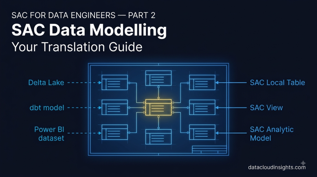

This is Part 2 of our SAP Analytics Cloud Terminology Series for data engineers. We follow Marie — a data engineer from the Azure and Databricks world — through her first weeks on an SAC implementation at RetailCo France. In Part 1 we covered SAC, BTP, Tenants, Stories, and Analytic Applications through Azure and Databricks analogies. Now Marie walks into her first data modelling workshop.
The workshop that almost broke Marie
End of week two. Marie had survived the project kickoff, learned the five basic platform terms, and was feeling reasonably confident. Then the data modelling workshop happened.
She walked in on Monday morning with her MacBook, a large coffee, and the quiet confidence of someone who has been building data models in Databricks for three years. Delta Lake gold layers. Star schemas. Fact tables and dimension tables. Slowly Changing Dimensions. She knew this world.
The lead SAP consultant, a calm Frenchman named Laurent who had been implementing SAP analytics since before Databricks existed, opened the session.
“This week we design the SAC models for RetailCo. We will define the account dimension structure, configure the time dimension granularity, design the version concept for the planning model, set up measure hierarchies, and discuss restricted measures versus calculated measures at model level versus Story level.”
Marie typed everything into her notes with the speed of someone who is definitely keeping up and absolutely not panicking.Then she leaned over to Thomas and whispered — “I understood maybe four words of that.”
Thomas smiled. “Which four?”
“Model. Time. Level. And ‘versus.'” This is Part 2. By the end of it Marie understood all of it. And so will you.
Term 1 — Model: Your Delta Lake table, but with business logic baked in
Marie’s first question to Laurent during the first coffee break was direct.
“When you say SAC Model — is that a table? A view? A schema? What is it physically?”
Laurent appreciated the precision.
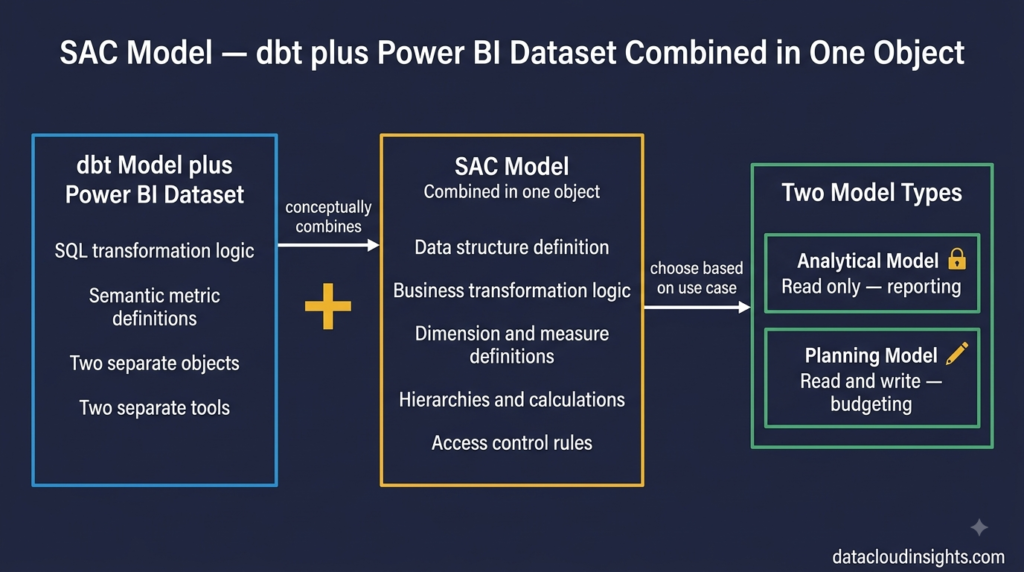
“Think of it as a semantic layer sitting on top of your data. Like a gold layer table in Delta Lake — but instead of just storing clean, aggregated data, it also contains the business logic that defines how that data should be understood and analysed. Which columns are dimensions. Which are measures. What the hierarchy structure is. What calculations apply. What currencies are used. All of that lives in the Model.”
Marie thought about it. In her Databricks world, the gold layer table stored clean data. Business logic — calculations, aggregations, hierarchies — lived partly in the table itself through views and partly in Power BI’s semantic model on top. Two separate places.
In SAC the Model brings those two things closer together. The Model is both the data structure and the business logic layer in one place.
“So it is like a dbt model combined with a Power BI dataset?” she asked.
Laurent had never used dbt. But Thomas had.
“That is actually a really good way to think about it,” Thomas said. “The SAC Model is where you define transformations and business rules — like dbt. And it is also what Stories connect to — like a Power BI dataset. One object doing both jobs.”
Marie wrote that down. SAC Model = dbt model plus Power BI dataset combined. Not perfectly accurate at a technical level — but accurate enough to work with on your first project.
There are two types of SAC Models and the difference matters enormously in practice.
An Analytical Model is read-only. Data flows into it from a source system and business users can only view it. You use this for reporting dashboards — the CFO revenue overview, the logistics performance dashboard, the store comparison report. Nobody enters data into an Analytical Model. It is purely for consuming and visualising data.
A Planning Model is read-write. Business users can enter data directly into it — budget numbers, forecast figures, target values. You use this for financial planning processes — annual budgeting, rolling forecasts, headcount planning. The planning model is both a data store and a reporting layer simultaneously.
Marie made the classic data engineer mistake on day three of the workshop. She started designing what the finance team needed as an Analytical Model — clean structure, optimised for query performance, read-only — because that is how a data engineer thinks about a gold layer table.
Laurent stopped her gently.
“The finance team needs to enter their budget numbers directly in SAC. They cannot do that in an Analytical Model.”
Marie stared at her design. “So they need a Planning Model.”
She redesigned from scratch. Two hours of work gone. She was frustrated with herself but Laurent was philosophical about it.
“Everyone does this on their first SAC project,” he said. “The instinct to separate read from write is correct in a data engineering context. In SAC Planning the write capability is a feature, not a design smell. Once you internalise that, everything else about Planning Models makes sense.”
Always clarify upfront — is this model for reporting only, or does anyone need to write data back into it? That single question determines the model type and saves you from redesigning halfway through the workshop.
Term 2 — Dimension: Familiar concept, different rules
Marie knew dimensions. Star schema. Dimension tables surrounding a central fact table. Customer dimension, product dimension, time dimension, geography dimension. She had built them in Databricks, modelled them in dbt, connected them to Power BI.
So when Laurent said “dimension” she thought she was on solid ground.She was mostly right. With two important differences that caught her out.
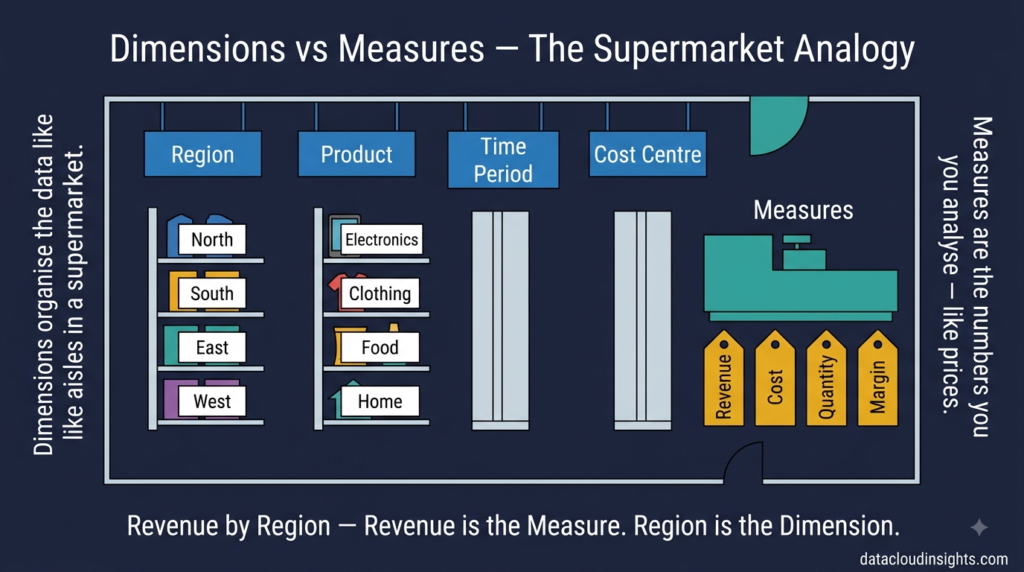
In SAC, a dimension is exactly what a data engineer would expect — a descriptive attribute used to categorise, filter, slice, and group your measures. Region, Product, Cost Centre, Customer, Employee — all dimensions. You put dimensions on chart axes. You use them as filters. You drill through them in hierarchies. Fundamentally the same concept as a dimension table in a star schema.
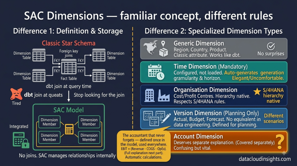
The first difference — dimensions in SAC are defined inside the Model, not as separate tables.
In Databricks Marie had separate dimension tables — dim_product, dim_customer, dim_region — joined to fact tables through foreign keys. The join happened at query time. Classic star schema.
In SAC the dimensions live inside the Model itself. There are no separate dimension tables to join. You define the dimension members — the list of products, the list of regions, the list of cost centres — directly within the Model structure. The Model handles the relationship internally.
This felt wrong to Marie initially. “Where is the join?” she kept asking.
“There is no join,” Thomas said. “SAC handles the relationship between dimensions and measures internally. You define the structure. SAC manages the rest.”
It takes a few days to stop looking for the join. Then it starts feeling natural.
The second difference — SAC has special dimension types that do not exist in a standard star schema.
Laurent walked the workshop through the list.
A Generic Dimension is what Marie expected — Region, Product, Country. Standard categorical attributes. Behaves exactly like a dimension table in a star schema. No surprises here.
A Time Dimension is mandatory in every SAC Model. Unlike a standard date dimension table in Databricks where you might have a dim_date table with every date from 2010 to 2030 and all its attributes — the SAC Time Dimension is configured rather than populated. You define the granularity (daily, monthly, quarterly, yearly), the fiscal year variant, and the planning horizon. SAC generates the time members automatically. You do not load date records manually.
Marie found this either elegant or uncomfortable depending on the day. On good days — elegant. No more maintaining dim_date tables. On bad days — uncomfortable because she could not see the data the way she was used to.
An Account Dimension has no equivalent in a standard data engineering model and is the one that confused Marie most deeply. We will cover it separately in a moment because it deserves its own explanation.
An Organisation Dimension represents organisational structures — cost centres, profit centres, company codes, business units. It supports hierarchies natively and respects SAP’s organisational model, which is important when your data comes from S/4HANA where the organisational structure is deeply embedded in the data.
A Version Dimension is unique to Planning Models and represents the different planning scenarios — Actual, Budget, Forecast, Prior Year. Again no equivalent in a standard data engineering model. We will cover Versions properly in Part 4 when we get into Planning.
Term 3 — Measure: The concept translates, the implementation surprises
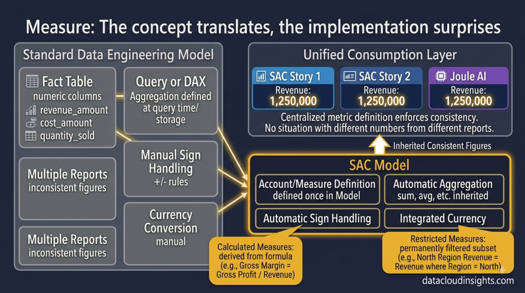
Measures Marie understood immediately. Numerical values you aggregate and analyse. Revenue, Cost, Quantity, Headcount, Margin. The equivalent of the numeric columns in a fact table. Sum them, average them, count them — that is what measures are for.
The concept maps directly from data engineering. The implementation has one important difference.
In Databricks, Marie’s fact tables had numeric columns — revenue_amount, cost_amount, quantity_sold. The aggregation logic — sum by region, average by month, count by product — was defined at query time or in Power BI DAX measures on top.
In SAC, measures are defined inside the Model. The aggregation behaviour, the currency, the sign (positive or negative), the formatting — all defined once at model level. Every Story that uses this Model inherits all of those definitions automatically.
Marie’s first reaction was positive. “So I define the measure once and it is consistent everywhere?”
“Exactly,” said Laurent. “No more situation where the revenue figure in one Power BI report uses a different DAX measure than another report. One definition. One place. Every Story that connects to this Model shows the same revenue figure calculated the same way.”
This is genuinely one of SAC’s strengths — centralised metric definitions that enforce consistency across all reports. For a data engineer who has spent time debugging why two Power BI reports show different revenue numbers because two developers wrote different DAX measures — this is a satisfying concept.
Then Laurent introduced Calculated Measures and Restricted Measures and Marie’s Databricks mental model started to creak slightly.
A Calculated Measure is a measure derived from other measures using a formula — defined at model level. Gross Margin Percentage calculated as Gross Profit divided by Revenue multiplied by 100. It does not exist in the source data. SAC calculates it on the fly for every dimension intersection.
“Like a calculated column in Power BI or a derived metric in dbt?” Marie asked.
“Closer to a calculated column in Power BI’s semantic model,” Thomas said. “Defined once, available everywhere, calculated at query time not storage time.”
A Restricted Measure is a measure permanently filtered to a specific subset of data — also defined at model level. North Region Revenue is the Revenue measure permanently filtered to Region equals North. Instead of every report builder applying the same filter manually — define it once as a restricted measure and it is available to every Story connected to this Model.
“Like a parameterised view in SQL?” Marie offered.
Laurent considered it. “Closer to a pre-defined filtered metric. Like if in dbt you created a specific model called revenue_north_region that was just your revenue model filtered to North. Except in SAC you define it inside the Model rather than as a separate object.”
Marie wrote “restricted measure = pre-filtered metric, defined once, reused everywhere” in her notes.
The analogy is not perfect. But it is close enough to work with.
Term 4 — Account Dimension: The concept that has no data engineering equivalent
This is the one that genuinely stumped Marie. Not because it is complicated — but because there is nothing like it in the Azure and Databricks world she came from.
Laurent introduced the Account Dimension on day two of the workshop.
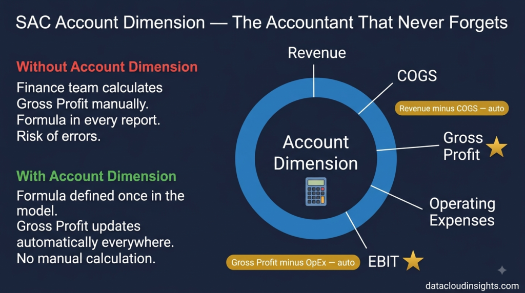
“The Account Dimension represents your chart of accounts — the financial line items. Revenue, Cost of Goods Sold, Gross Profit, Operating Expenses, EBIT. It is a special dimension type in SAC that understands financial logic — debit and credit sign handling, formula accounts that calculate automatically, account hierarchies for financial statement structures.”
Marie raised her hand.
“Why is this different from a regular Generic Dimension? Could we not just create a dimension called Account Type with members Revenue, COGS, Gross Profit, and so on?”
Good question. Laurent explained.
“You could. But then Gross Profit would just be a member with a value you enter manually. The Account Dimension lets you define Gross Profit as a formula account — it automatically equals Revenue minus COGS. You never enter Gross Profit manually. Any time Revenue or COGS changes, Gross Profit updates instantly. And the Account Dimension understands sign conventions — Revenue is positive, expenses are negative — automatically. Without that, your aggregated totals would be wrong.”
Marie thought about this from a data engineering perspective.
In her Databricks world, this kind of logic lived in transformation code. A dbt model would calculate Gross Profit as revenue - cogs. The formula lived in SQL. The output landed in the gold layer table as a column.
In SAC the formula lives inside the Account Dimension itself. No transformation code. No intermediate table. Laurent defines Gross Profit as Revenue minus COGS directly in the Account Dimension configuration — and SAC handles the calculation at query time, for every dimension intersection, automatically.
“So the Account Dimension eliminates a whole layer of transformation logic that I would normally write in dbt or Databricks?” Marie asked.
“For financial statement calculations — yes. For a standard P&L, the Account Dimension replaces what would otherwise be a significant amount of transformation code.”
Marie sat with that for a while. It was uncomfortable — as a data engineer she liked to see and control transformation logic explicitly. But she could see the practical value. Defining Gross Profit = Revenue - COGS once in the Account Dimension, and having it work correctly everywhere automatically, was genuinely elegant for a finance use case.
She did not fully love it until two weeks later when the finance team changed the Gross Profit formula and Laurent updated it in one place in the Account Dimension — and every single Story and report across the entire RetailCo SAC implementation updated instantly. No dbt run. No pipeline trigger. No deployment.
“Okay,” Marie said when she saw that. “I understand why this exists now.”
Term 5 — Hierarchy: Familiar concept, built differently
Marie knew hierarchies. In Databricks she had built parent-child hierarchies in dimension tables — product_category, product_line, product_sku as columns in a dim_product table. Or a separate dim_product_hierarchy bridge table for more complex structures. Power BI could consume these and enable drill-down in reports.
SAC Hierarchies work on the same principle but are defined inside the Model directly rather than in separate tables.
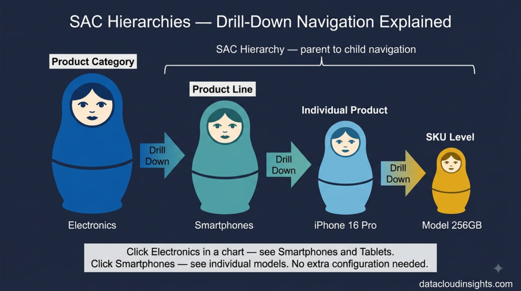
A hierarchy in SAC defines parent-child relationships within a dimension — allowing users to drill from summarised totals down to granular detail in charts and tables.
The RetailCo product hierarchy has three levels. At the top — Product Category (Clothing, Electronics, Home Goods, Food). In the middle — Product Line (within Clothing: Men’s, Women’s, Children’s). At the bottom — individual Product SKU.
In a Story, a user looking at the revenue chart sees total revenue by Product Category at first glance. They click on Clothing — the chart drills down to show revenue by Product Line within Clothing. They click on Men’s — it drills to individual SKUs within Men’s Clothing.
That navigation is powered by the hierarchy defined in the Model.
The difference from Marie’s Databricks approach — in Databricks the hierarchy columns exist in a flat dimension table and the drill-down behaviour is configured in Power BI on top. In SAC the hierarchy is defined inside the Model and the drill-down behaviour flows automatically into every Story that uses the Model. One definition, consistent behaviour everywhere.
Thomas explained it to Marie with a comparison she liked.
“In Power BI you define a hierarchy in the data model view — drag Product Category above Product Line above SKU to create the drill path. SAC is the same concept but the hierarchy lives in the SAC Model rather than in the Power BI semantic layer.”
Marie nodded. “So it is the same idea, just one layer earlier in the stack.”
“Exactly.”
That is a good mental model. SAC pushes more business logic — hierarchies, calculations, restrictions — into the Model layer that in a Microsoft stack would live in the Power BI semantic model. The data engineering layer underneath is simpler. The SAC Model layer is richer.
End of the data modelling workshop — Friday afternoon
Five days. Marie’s notebook had twelve pages of notes, four crossed-out diagrams, two coffee stains, and one large star next to the sentence “SAC Model = dbt model plus Power BI dataset.”
She walked out of the workshop on Friday afternoon feeling something she had not expected to feel.
Respect.Not for SAC specifically. For the problem it is solving.
SAP enterprises have complex financial data structures — account hierarchies, organisational structures, currency conversions, planning versions. The SAC data model is designed from the ground up to handle that complexity in a way that a generic data engineering stack like Databricks plus dbt plus Power BI has to work much harder to replicate.
The trade-off is flexibility. In Databricks Marie can do anything with her data — any transformation, any structure, any logic. SAC’s Model is more opinionated. It wants your data to look a certain way. It rewards you when it does and fights you when it does not.
On the train home she summarised the week in five lines.
SAC Model — semantic layer combining data structure and business logic. Two types — Analytical (read only for reporting) and Planning (read-write for budgeting). Define model type before anything else.
Dimension — same concept as a dimension table but lives inside the Model. Special types: Generic, Time, Account, Organisation, Version. Each has specific behaviour and rules.
Measure — numeric values defined at model level with aggregation logic, currency, and sign built in. Consistent across all Stories automatically.
Account Dimension — financial chart of accounts with formula accounts and sign handling. Eliminates transformation code for standard P&L calculations. No direct equivalent in standard data engineering stacks.
Hierarchy — parent-child structure within a dimension enabling drill-down. Defined once in the Model, works everywhere automatically.
She put her MacBook in her bag.
What is coming in Part 3
Soon — the build starts. The consultants have divided the work. Marie is responsible for setting up the data connections between RetailCo’s Azure Data Lake and SAC. She will be bridging the two worlds she knows — Azure on one side, SAC on the other.
Marie sits in the middle between the Azure data platform and SAC and figures out how to connect them. What works natively, what requires SAP Datasphere in the middle, and what nobody tells you about live connections versus imports when one side is SAP and the other side is Azure.
Subscribe below to get notified when Part 3 publishes.
The complete series:
- Part 1 — Platform basics: SAC, BTP, Tenant, Story, Analytic Application
- Part 2 — Data modelling: Model, Dimension, Measure, Account Dimension, Hierarchy (you are here)
- Part 3 — Dashboard building: Page, Widget, KPI Tile, Input Control, Drill Down, Linked Analysis
- Part 4 — Planning terms: Version, Data Action, Spreading, Data Locking, Planning Sequence
- Part 5 — Security and Admin: Role, Data Access Control, Transport, Content Network
- Part 6 — Connections: CDS View, Cloud Connector, Datasphere, BDC, OData
What to read next on Data Cloud Insights
If this series gave you the foundation you needed — these articles go deeper on specific topics:
- SAP Analytics Cloud Complete Beginner’s Guide
- How to Build Your First SAP Analytics Cloud Story
- SAP Analytics Cloud Data Sources: Complete Connection Guide
- SAP Analytics Cloud Planning: Build Your First Budget Model
- SAP Analytics Cloud Performance: 10 Tips to Make Reports Faster
- SAP Analytics Cloud vs Power BI: Honest Comparison
- SAP Analytics Cloud Certification Guide
Written by someone who has watched data engineers and SAP modellers stare at each other across a whiteboard for three days before realising they were describing the same concept in different languages.

Pingback: SAP Analytics Cloud Security and Administration: What Beginners Need to Know (Part 5)
Pingback: SAP Analytics Cloud Connections: CDS Views, Datasphere and Cloud Connector Explained (Part 6)