
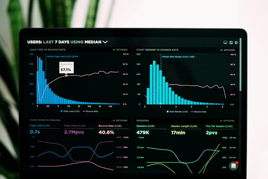

Welcome to Part 2 of our SAP Analytics Cloud series. In Part 1 we covered what SAP Analytics Cloud is, its three pillars, and how it fits into the SAP ecosystem.
In this part we get practical. By the end of this guide you will have built your first SAP Analytics Cloud Story — a real interactive dashboard using your own data.
No prior SAC experience needed. Let’s go.
What is an SAP Analytics Cloud Story?
In SAP Analytics Cloud, a Story is what other tools call a dashboard or report. It is a canvas where you combine charts, tables, images, and text to visualise your data and tell a story about what is happening in your business.
Think of a Story as a PowerPoint presentation — but live, interactive, and connected directly to your data.
Every dashboard you see in SAC is a Story. Every report your finance team uses is a Story. Learning to build Stories is the most important skill in SAP Analytics Cloud.
What you need before starting
Before building your first Story you need:
- A free SAP Analytics Cloud trial account — sign up at sap.com/sac-trial
- A simple Excel or CSV file with data — sales figures, budget numbers, anything with rows and columns works perfectly
- A browser — SAC runs entirely in your browser, nothing to install
That is it. No SAP system needed for your first Story.
Step 1 — Log into SAP Analytics Cloud
Go to your SAC trial URL — it looks like:
https://[your-tenant].eu10.hanacloudservices.cloud.sapYou received this URL in your trial confirmation email. Log in with your SAP credentials.
You land on the SAC Home Screen — your starting point for everything.
What you see on the home screen:
- Left sidebar — main navigation menu
- Stories section — your saved dashboards
- Sample content — pre-built examples from SAP
- Recent files — your recent work
Spend 5 minutes exploring the sample Stories SAP includes. Click on them, interact with the charts, get a feel for what a finished Story looks like before building your own.
Step 2 — Prepare your data file
For your first Story you will upload a simple Excel file. Here is a sample dataset you can copy into Excel right now:
| Month | Region | Product | Revenue | Target |
|---|---|---|---|---|
| January | North | Product A | 45000 | 40000 |
| January | South | Product A | 38000 | 42000 |
| February | North | Product A | 52000 | 48000 |
| February | South | Product B | 41000 | 45000 |
| March | North | Product B | 61000 | 55000 |
| March | South | Product A | 44000 | 46000 |
Save this as sales-data.xlsx on your desktop. This becomes your first SAC data model.
Important tip: Keep your Excel file clean before uploading — no merged cells, no empty rows, clear column headers in row 1. SAC imports clean structured data best.
Step 3 — Create your first data model
Before building a Story you need a Model — this is how SAC understands your data.
In SAC, click the main menu (☰) → Modeler → New Model
Select “Import a file” → upload your sales-data.xlsx file.
SAC automatically detects:
- Dimensions — text columns like Month, Region, Product — these are your filters
- Measures — number columns like Revenue and Target — these are what you analyse
Review what SAC detected and click Create Model.
Give your model a clear name: Sales Analysis Model
Click Save. Your first data model is ready.
Step 4 — Create a new Story
Now the exciting part — building your dashboard.
Click the main menu (☰) → Stories → New Story
SAC gives you two canvas options:
- Responsive — adapts to different screen sizes automatically — recommended for most use cases
- Classic — fixed size canvas — better for precise pixel layouts
Select Responsive for your first Story.
You land on a blank canvas. This is where you build.
Step 5 — Add your first chart
Click Insert in the top menu → Chart
A chart placeholder appears on your canvas. On the right panel:
- Click “Select Model” → choose your Sales Analysis Model
- Under Measures — drag Revenue to the Values field
- Under Dimensions — drag Month to the Dimension field
- SAC instantly generates a bar chart showing revenue by month
You just created your first SAC visualisation. 🎉
Customise the chart:
- Click the chart → Styling panel on the right
- Change chart type — try Line chart for trend view
- Add data labels — toggle “Show Data Labels”
- Change colours — click any bar to change its colour
Step 6 — Add a KPI tile
KPI tiles show single key numbers at the top of dashboards — total revenue, achievement percentage, variance from target.
Click Insert → KPI Tile
Configure it:
- Primary Value: Revenue — sum
- Comparison Value: Target — sum
- SAC automatically calculates variance and shows green or red
Place it at the top of your canvas above the chart. This gives your dashboard an executive summary at a glance.
Step 7 — Add a table
Charts give overview — tables give detail. A good dashboard has both.
Click Insert → Table
Configure:
- Rows: Region and Product
- Columns: Month
- Values: Revenue
You now have a crosstab table showing revenue breakdown by region, product, and month — exactly like a pivot table in Excel but live and interactive.
Step 8 — Add filters and input controls
This is what makes SAC dashboards truly interactive — filters let users slice data without editing the Story.
Click Insert → Input Control
Select Region as the dimension. A dropdown filter appears on your canvas.
Now when someone using your dashboard selects “North” from the filter — every chart and table on the page automatically updates to show only North region data.
Add a second filter for Month — now users can filter by both region and time period independently.
This interactivity is something Excel simply cannot match.
Step 9 — Style and format your Story
A professional looking dashboard builds trust with your audience. SAC has strong styling options.
Page background:
- Click anywhere on canvas background
- Right panel → Canvas Settings
- Change background colour — dark navy blue works well for executive dashboards
Consistent fonts:
- Select all text elements → set the same font throughout
- SAC uses Helvetica by default — clean and professional
Layout tips:
- KPI tiles at the top
- Main chart in the centre — largest element
- Table at the bottom
- Filters on the left sidebar or top right
Add a title:
- Click Insert → Text
- Type: Sales Performance Dashboard — 2026
- Make it large, bold, and white if using dark background
Step 10 — Save and share your Story
Click Save in the top menu. Give your Story a clear name:
Sales Performance Dashboard — My First StoryChoose a folder to save it in — create a folder called My Dashboards to keep things organised.
To share with others:
- Click the Share icon top right
- Enter email addresses
- Choose permission level — View only or Edit
- Click Send
Your colleagues receive an email with a direct link to your live interactive dashboard.
Common mistakes beginners make in SAC Stories
After implementing SAC across multiple enterprise clients these are the mistakes we see most often:
1. Too many charts on one page
More than 6-8 visualisations on one page overwhelms users. Split into multiple pages — SAC Stories support multiple pages like PowerPoint slides.
2. Not using the right chart type
Bar charts for comparisons. Line charts for trends over time. Pie charts only for simple part-to-whole with maximum 5 segments. Never use 3D charts — they distort data perception.
3. Ignoring mobile view
In Responsive canvas, always check the mobile layout. Click View → Mobile Preview to see how your dashboard looks on phone. Many SAC users access dashboards on mobile.
4. No clear title or context
Every chart needs a title that answers “what am I looking at?” — not just “Revenue” but “Monthly Revenue vs Target — 2026”
5. Skipping data model preparation
Messy source data creates messy dashboards. Clean your Excel file before uploading — your dashboard is only as good as your underlying data.
What’s next in this series
You have now built your first SAP Analytics Cloud Story. That is a real achievement — most people never get past reading about SAC.
Coming up in Part 3 — we move beyond Excel uploads and connect SAC directly to live data sources including SAP S/4HANA and SAP Datasphere. This is where SAC becomes genuinely powerful for enterprise use.
The full series:
- Part 1 — What is SAP Analytics Cloud?
- Part 2 — Building your first SAC Story and Dashboard( you are here)
- Part 3 — Connecting SAC to your data sources
- Part 4 — SAC Planning — building your first budget model
- Part 5 — SAC AI features — Smart Predict and Search to Insight
- Part 6 — SAC vs Power BI — full honest comparison
Subscribe below to get notified when Part 3 publishes.
Key takeaways
- A Story is SAC’s term for a dashboard or report — it is the core deliverable of SAP Analytics Cloud
- You need a Model before building a Story — the model tells SAC how to understand your data
- Start with a clean Excel file — messy data creates messy dashboards
- Input controls make your dashboard interactive — filters update all charts simultaneously
- Mobile view matters — always check how your Story looks on phone
- SAP Analytics Cloud trial is free for 30 days — start building today
Published by the Data Cloud Insights team — SAP data professionals with hands-on enterprise implementation experience across Europe.



Pingback: SAP Analytics Cloud Dashboards: A Data Engineer's Guide to Building Stories (Part 3)
Pingback: SAP Analytics Cloud for Data Engineers: What You Need to Know Before Day One
Pingback: SAP Analytics Cloud Data Modelling: What Data Engineers Need to Know (Part 2)
Pingback: SAP Analytics Cloud Security and Administration: What Beginners Need to Know (Part 5)
Pingback: SAP Analytics Cloud (SAC): The Complete Guide for 2026 - Data Cloud Insights SAP Analytics Cloud (SAC): Complete Guide in 2026
Pingback: SAP Analytics Cloud Connections: CDS Views, Datasphere and Cloud Connector Explained (Part 6)